Math Visualizations: Animated Factorization Diagrams
Terry VanNoy
PD Specialist
Blog
Teq Supports District Implementation: Beyond funding guidance, Teq provides turnkey grant alignment, hardware staging, and certified PD coaching via OTISpd.com to ensure 100% classroom adoption.
As the “Teq-math-teacher-guy”, I feel compelled to offer you another math tech related post to help you in your instruction. The website, Data Pointed, is great for teachers working with elementary, middle, or high school level students. If you want a way to visually show your students number patterns and get them interested in the fascinating world of numbers, this site is for you!
Animated Factorization Tool on Data Pointed
Data Pointed has many built-in tools for showing representations of data, including maps, color values, and the factors of numbers. Scroll down a bit to find the one titled, “Animated Factorization Diagrams.”
The idea is that starting with the number 1, we see a picture of the number in dots. It starts automatically and goes forever, but you can stop and control which number is displayed. The play bar appears in the lower right part of your computer screen.

When working with students, I first let the animations play and ask students to look for patterns. What shapes do they see? Is there any order to the shapes they see such as circles, triangles, or squares? The key is to have students think of different predictions or theories for why certain numbers have particular shapes. The role of us, as teachers, is to ask the right questions and give students time to discuss and think about them. I have given expected answers to these questions as a guide below, but please share with us at otis@teq.com if you have other ideas.
Elementary Level
As students learn to count, show a number such as 10 and have them say or write number sentences that equal 10. Students should be able to come to the board and use ink tools to “prove” that 7 + 3 equals 10 (by circling the appropriate dots). When understanding and applying multiplication, you can advance into showing numbers such as 18. Here are some example questions appropriate for elementary-level activities:
- What shapes do you see? Answer: Triangle-like shapes
- Why is the number 18 this shape? Answer: Because of the factors of 18
- Which numbers can divide into 18? Do you see those in the diagram? Answer: 2, 3, 6, and 9
- 9 X 2 is 18. Where is that shown in the picture? Answer: Students can circle a pair of dots, then show how there are nine groups of them.
- How do you know that 6 is a factor of 18? Answer: It shows three groups of six.

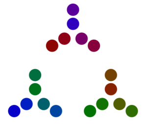
As an added bonus, teachers can use the Screen Shade feature from the SMART Ink Tool to cover up the factorization, which appears in the upper left, or use it to cover the dots and have students predict the number’s shape.
Middle School Level 
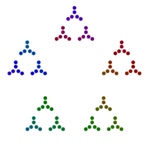
For students learning factors, multiples, and divisibility, teachers can show a number diagram and cover up the factorization. Students can do factor tree diagrams or say what the factorization is, then explain how it is shown in the dot diagram. For example, the number 18 equals 3 X 3 X 2 because we see three groups of two, two groups of three, etc.
- How are the numbers 9, 18, 27, and 90 related? Answer: They are made of similar shapes because they are all multiples of 9.
- Take any number such as 25. Predict the shapes of other numbers that are multiples such as 50 and 75. Why did you make that prediction? Answer: These numbers share common factors.
- What is the greatest common factor of 27 and 90? Answer: 9
- How can you tell from their diagrams? Answer: Look for the largest common shape within each diagram.
High School
With higher levels of math, the Data Pointed website can be helpful to discuss number theory and patterns. One example would be to look at prime numbers vs. composite numbers.
- Let the animations run for a bit (up to 200 or so) and notice some common shapes. Which numbers result in circles? Answer: Prime numbers such as 53.


- Which ones are circles within circles? Answer: Multiples of primes, such as 46 (2 X 23).

Notice that this pattern shows 23 pairs of dots.
- Can prime numbers ever be consecutive? Why or why not? Answer: No. Other than the number 2, no other primes are even. Students will see some prime numbers two apart from each other, such as 11 and 13 or 59 and 61. These are “twin primes” and can lead into further discussion.
Have fun with the Data Pointed website, as there are plenty of other tools and different ways to use them in your classroom. Share your other ideas and success stories with us by commenting below or emailing OTIS@teq.com. Looking for more math ideas? Check out our Math category on OTIS for educators.
For more tips, tricks, and tools for teaching in and out of the classroom, check out more content on the Teq Talk blog or our YouTube channels OTIS for educators and Tequipment.
We also offer virtual professional development, training, and support with OTIS for educators. Explore the technology and strategies that spark student success — no matter where teaching or learning are happening!
Follow us on social:
 edteq
edteq  OTIS4educators | Teq Products | iBlocks
  OTIS4educators | MyTeq
  Teq
Teq
0 thoughts on “Math Visualizations: Animated Factorization Diagrams”
Related Articles & Other Recommended Reading

What AI Tools Are Teachers Actually Using?
While having a variety of AI tools at your fingertips is helpful, the number of options can feel overwhelming. In our OTIS for educators session, “Demystifying AI Tools,” we’ll dive into the top AI platforms being used in education. We’ll uncover their ideal use cases, abilities, and limitations so that you can find the best fit(s) […]

Beat the June Burnout: 7 Low-Stress PD Sessions to Prep for Next Year
The countdown is on! Whether you’re a teacher officially on break or school is still in session, we’re celebrating another successful year. You’ve earned the time off to relax and maintain your skills with OTIS for educators! We’ve got tons of engaging PD courses all year round and have curated courses that will perfectly pair […]

Catch Teq at ISTE 2026!
Teq is ecstatic to attend the annual International Society for Technology in Education (ISTE) Live26! We’re excited to connect with educators and leaders alike to integrate cutting-edge edtech solutions that transform classroom instruction. Taking place from June 28th to July 1st, 2026, this top-notch event is being held at the Orange County Convention Center in […]